You’ve probably heard stories about the underlying bias in technology. For example, in 2015, Amazon realised that its AI recruiting tool favoured men for technical jobs. Until recently, Facebook advertisers could target ads according to sex, race, and religion and the algorithm discriminated. It prioritised women for nursing and secretarial roles and excluded Black men from housing ads. Machines reflect the biases of their human creators.
Systems that we build reflect our biases. Biased systems include religion, and contemporary Paganism and Witchcraft are not exempt. For instance, much has been said and written about the heteronormativity and sexism of Traditional Wicca. We have become more sensitive to race, sex, and gender issues, and Pagan spaces are increasingly diverse and inclusive. And yet there is a consistent lack of attention paid to accessibility principles.
I focus on web accessibility here because it’s what I know. I’ve never organised a festival or designed a ritual space to accommodate people with disabilities. So, I can’t tell you what it’s like to do that and share any learnings, but I have spent years designing, developing, and optimising websites and online content for accessibility.
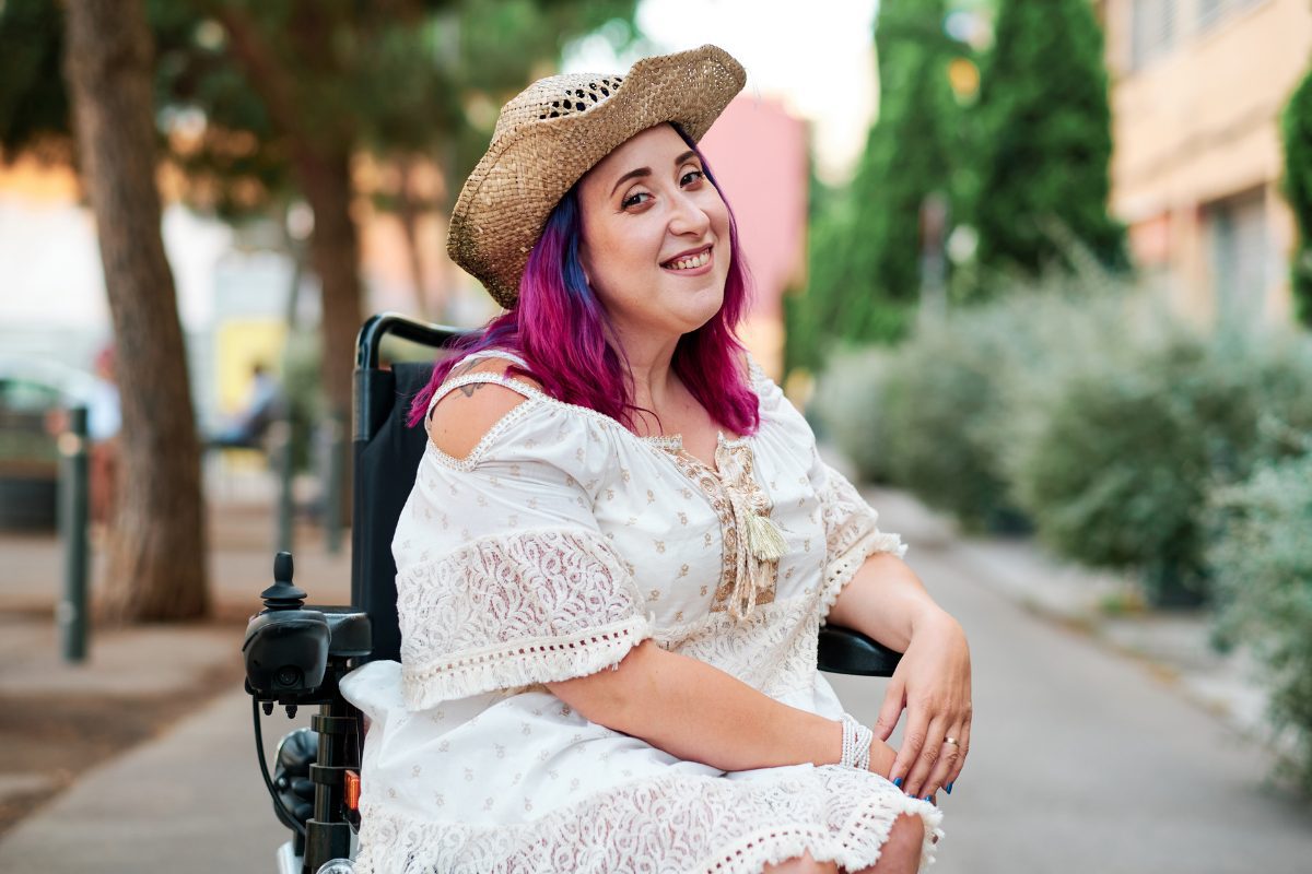
Accessibility means designing and developing your websites, tools, and technologies so that people with disabilities can use them. The International Symbol of Access is a blue square with a white, stylised image of a person in a wheelchair. We often think about disability as a health experience, such as a person with a visual or hearing impairment, motor or mobility issue, or cognitive and intellectual disabilities. But disability is a complicated phenomenon, and it can be visible or invisible, permanent, temporary, or situational. For instance, a person might have one arm, have an arm injury, or use a device one-handed while holding a baby. Therefore, we ought to think about disability in terms of exclusion.
Most of us don’t create to exclude people. We’re using our abilities as a starting point and end up with products, services, and content designed for people like ourselves–for people of a specific sex or gender, age, language ability, literacy, physical ability, and specific access to resources such as money and time. We may not realise that we are lowering or raising a barrier to participation.
Who gets to engage with your products, services, or content may be an intentional decision. For example, people who are just starting to explore Paganism and Witchcraft are welcome to read my blog, but I don’t write many how-to posts that interest beginners. Reading my content also requires a certain amount of digital and reading literacy. That is ok; it’s normal to have a target audience. Inclusive design isn’t about making one thing for all people. It’s about designing various ways for people to experience what you are offering. So, if I’ve done a good job, you can still read my site if you’re colour blind, using assistive technology such as a screen reader or using alternative hardware to interact with my site. Solving for one often can extend to many. A solution that works well for a blind person may also benefit a person driving a car.
Web Content Accessibility Guidelines (WCAG) 2.0 are widely accepted as the definitive guidelines for creating accessible websites. Many of us do not have the resources to audit our websites and meet all these standards, but there are simple actions we can take to make our content more accessible.

Use plain English
Plain English is clear, concise, and avoids jargon. Some people think that using bigger words makes them appear smarter; it doesn’t. It makes them look gaudy, pretentious, and like they don’t know how to communicate.
Plain English is clear, straightforward expression, using only as many words as are necessary. It is language that avoids obscurity, inflated vocabulary and convoluted sentence construction. It is not baby talk, nor is it a simplified version of the English language. Writers of plain English let their audience concentrate on the message instead of being distracted by complicated language. They make sure that their audience understands the message easily.
Professor Robert Eagleson, Australia
Use accessible fonts
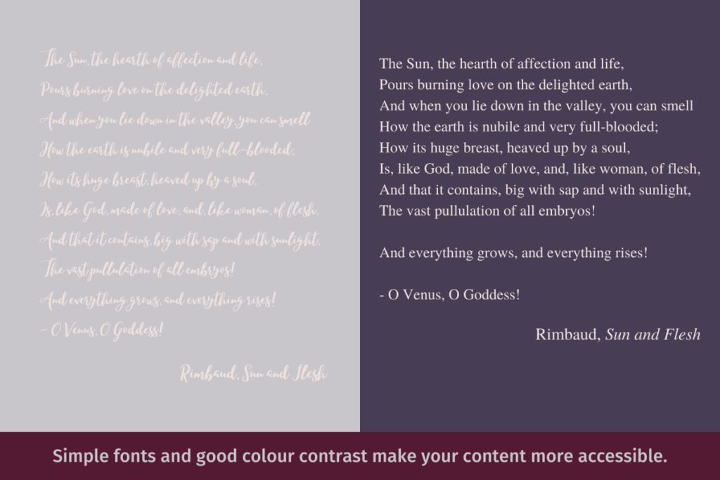
Some fonts are hard to read even when you don’t have low vision or dyslexia. Using accessible fonts ensures that everyone can read your content, including people with visual impairments and neurodiversity. Avoid fonts that are complex and ambiguous. Try not to use fonts smaller than 12px (16px is better).
Give your content space
We’ve all seen a wall of text–a long piece of content that is not formatted and is hard to read. Assuming that you want people to read, understand, and engage with your content, a little formatting goes a long way. At a minimum, break up the wall of text into paragraphs. Add headlines and subheadings, images, italics, bold, and lists to help readers find the information they need.
Check your colour combinations
Colour blindness affects one in 12 men (8%) and 1 in 200 women (0.5%). Not having enough colour contrast is one of the most common accessibility issues. Free online tools such as WebAIM’s Color Contrast Checking Tool and Siteimprove can help you check your colour schemes.
Add captions to your YouTube videos
There are many Pagans creating videos, and very few of them add captions. YouTube uses speech recognition technology to create captions automatically, but they get them wrong due to accents, dialects, background noises, etc. In my experience, it almost always gets Aboriginal words wrong, and it also struggles with grammar, punctuation, describing sounds, and differentiating speakers.
Closed captions are essential for viewers with hearing impairments. They’re also great for viewers watching in their non-native language and valuable for people who watch videos with the sound turned off. For content creators monitoring their metrics, captions improve your video’s SEO ranking, watch time, and engagement.
Accessibility and legislation
Compliance with web accessibility is a legal requirement. Under Australia’s Disability Discrimination Act of 1992, government agencies and public-facing organisations must meet WCAG standards. In 2000, Bruce Maguire, a blind man, won a $20,000 court case against the Sydney Organising Committee of the Olympic Games because it had failed to make its official website, Sydney Olympic Games, adequately accessible to blind users. In 2014, Gisele Mesnage, a blind woman, sued the supermarket giant Coles because she couldn’t use its website for online delivery.
In the U.S., Title III of the Americans with Disabilities Act (ADA) prohibits discrimination based on disability, and Section 508 Amendment to the Rehabilitation Act of 1973 requires all Federal agencies’ electronic and information technology to be accessible. Winn Dixie, Domino’s Pizza, and Five Guys are among the many companies that have seen website accessibility lawsuits.
Most of us aren’t the Sydney Olympics, a supermarket giant, or a restaurant chain. We’re not likely to suffer any legal consequences if we fail to make our content accessible. But we should care about web accessibility for the same reasons that we care about the rights and civil liberties of women, LGBTIQ+ people, people of colour, and so forth: to provide equal access and equal opportunity and help people participate more actively in society.


Great advice. Captioning videos isn’t all that easy if you don’t subscribe to OtterAI or such. Using YouTube’s native caption system is clunky. And whilst your font it readable (I make it bigger, no problem, browsers do that) it is grey on white. More contrast would be awesome. I try to read all your posts but sometimes it is tiring to my (fairly low vision) eyes, esp. if I’ve missed a post and want to read two.
Thanks, Rowan! I appreciate that feedback. Revisiting the accessibility of some of the design elements here is on my to-do list. I hope to finish this redesign by the end of May.